EXTENDS VM GENERAL

VM Foundation — Content Guide

This site is the VM General base plus a research/work library and data‑table tools. This page documents only the Foundation additions and changes — for everything else use VM General.

What this site adds on top of the base

Everything in VM General works here unchanged. On top of it, the Foundation site adds a publications library and tools for displaying data.

The Foundation‑only additions at a glance

  • Work and Research — two new content libraries (Work = resources like toolkits / model legislation / templates; Research = publications/reports).
  • Data blocks: CSV Table and Interactive Table — build a table on the page from a spreadsheet file.
  • A full‑page Search block, plus finished Columns Text, Image with legend and Stats blocks.
  • The colour switch gains a third option — Green — and the footer newsletter can take a custom embed code.
  • Jobs works the same as on VM PAC.
How to read this page: items are tagged NEW (Foundation‑only) or CHANGED (exists in the base but behaves differently here).
Shared enhancements (same as VM PAC). These upgraded blocks also exist here and behave exactly as documented on the VM PAC page — see there to avoid repetition: Hero (video), Cards Slider, Job Listing, Multi‑Column Stats, Section with Side Menu (table of contents), Quote Slider (carousel). Jobs works the same as VM PAC → Jobs.
Mamas are not set up here. The editor may still show a "Mamas filters" block and a "Mamas" option in Cards Slider, but the Foundation site has no candidate database or importer (that's a VM PAC feature). Don't use the Mamas options on this site unless the developer confirms otherwise.

New & changed blocks

Only blocks that differ from the base are listed. Screenshots will be added later. Jump to one:

CSV Table acf/csv-table NEW

Turns a spreadsheet file into a clean table on the page. The first row becomes the column headers; any cell that contains a web address is shown as a clickable link automatically.
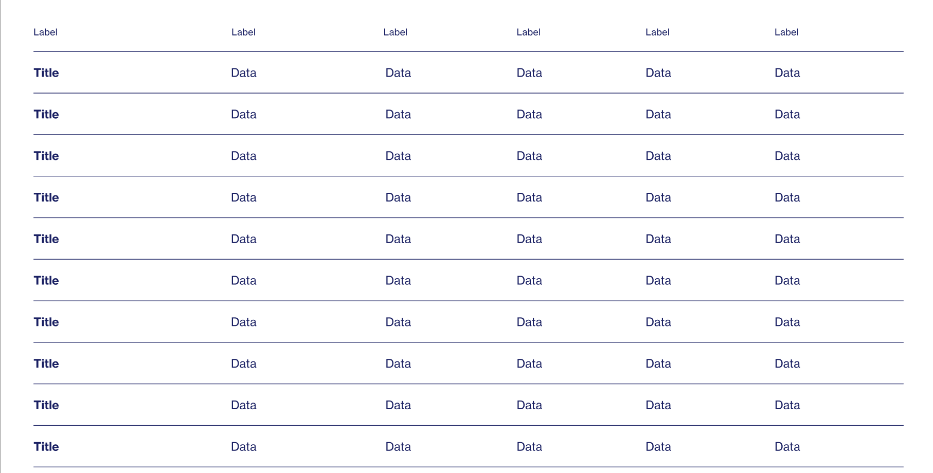
CSV Table block
CSV Table block
FieldTypeHow to fill it
CSV DatarequiredFileUpload a .csv file (export one from Excel/Google Sheets). The table is rebuilt from it.
TitleRich textOptional heading above the table.

How the CSV should look

  • First row = column headings. Every following row is one table row.
  • Use a plain comma‑separated file. In Excel/Google Sheets choose File → Download/Save as → CSV (a "CSV UTF‑8" export is fine — the byte‑order mark is handled).
  • If a value itself contains a comma, wrap that cell in double quotes: "Smith, Jane".
  • You may put a list inside one cell as ["A","B","C"] — it's shown as A, B, C.
Name,Office,State,Year
Jane Smith,U.S. House,California,2024
"Doe, Maria",State Senate,Texas,2023

Making a cell into a link (optional)

Add two columns named exactly Approval method and Approval link. The table then hides the Approval link column and turns each Approval method cell into a clickable link (opens in a new tab):

Name,State,Approval method,Approval link
Jane Smith,California,Official statement,https://example.org/jane
John Doe,Texas,Press release,https://example.org/john
To update the table, re‑export the spreadsheet to CSV and replace the file. No manual cell editing on the page.
Reading large tables: the first row (headings) and the first column stay put (frozen) while you scroll — so you always see which state/row and which column you're looking at. No setup needed; it works automatically.
Interactive Table acf/interactive-table NEW

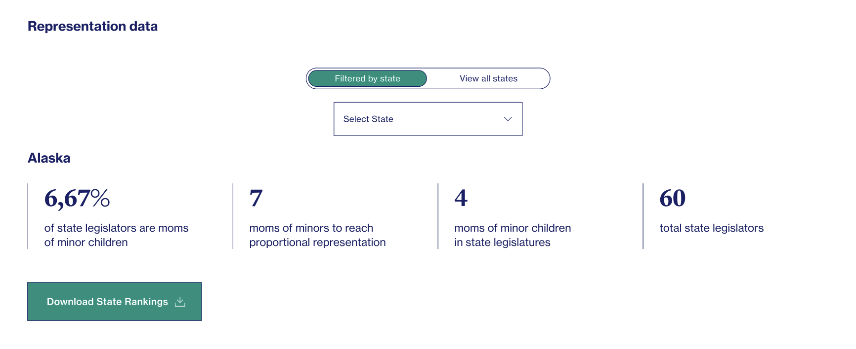
Like CSV Table, but interactive — readers can work with the data — and you can describe individual columns.

Interactive Table block
FieldTypeHow to fill it
CSV DatarequiredFileThe .csv file with your data.
ColumnsRepeaterOne row per column you want to show in the per‑state detail view — a Column index and a Column description (see below).
ButtonLinkOptional button (e.g. download the full dataset).

How the CSV should look

This block is built around US states: it reads a column to build a "Select State" filter, so the data is normally one row per state.

  • First row = column headings; comma‑separated, UTF‑8 — same as CSV Table.
  • One column must be named state (any capitalisation). That column feeds the state picker.
  • Add the other columns you want to display per state (e.g. a figure, a status, a date).
state,Bills passed,Status,Updated
California,12,Active,2024-01-15
Texas,8,Active,2024-02-03
New York,5,Under review,2024-01-28

Filling in the "Columns" repeater

For each data column you want to show when a reader picks a state, add one repeater row:

Column indexColumn descriptionMeans
0StateThe first column (state). Counting starts at 0.
1Bills passedLabel shown for the 2nd column's value.
2StatusLabel for the 3rd column.
3Last updatedLabel for the 4th column.
Column index counts from 0 — the first column is 0, the second is 1, and so on. The Column description is the friendly label readers see; a description of "State" is used as the heading rather than a data line. The full sheet is always available under the "View all states" tab.
How the picker behaves: the "Select State" dropdown is sorted alphabetically automatically (whatever order the CSV is in). When the page loads, the first state is shown by default, and the selected state's data is centered beneath the picker.

Columns Text acf/columns-text NEW

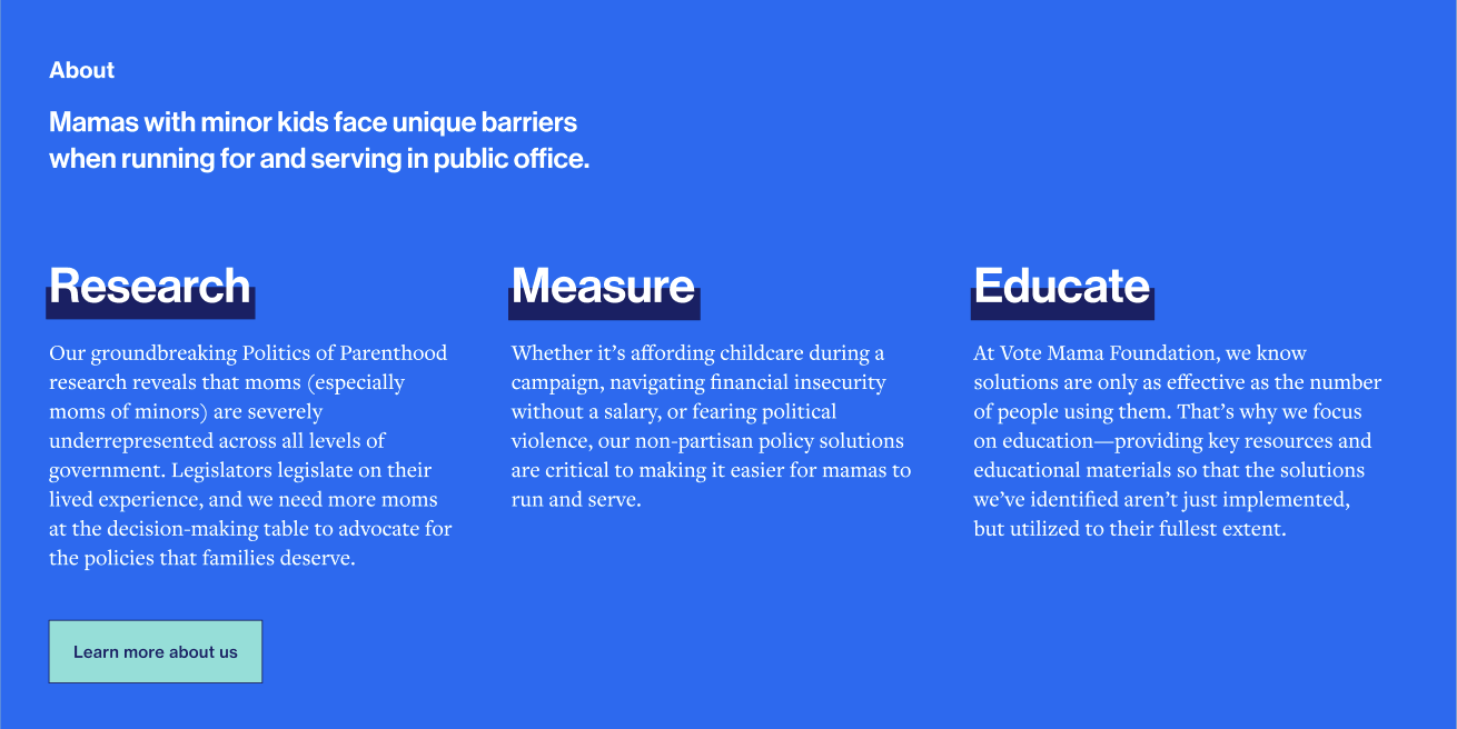
A row of short text columns (each with its own small heading), under an optional eyebrow label and above an optional button.

Columns Text block
Columns Text block
FieldTypeHow to fill it
Pre headingTextSmall eyebrow label above the columns.
ColumnsRepeaterOne row per column, each with a Title and a Text.
ButtonLinkOptional button below the columns.

Image with Legend acf/image-with-legend NEW

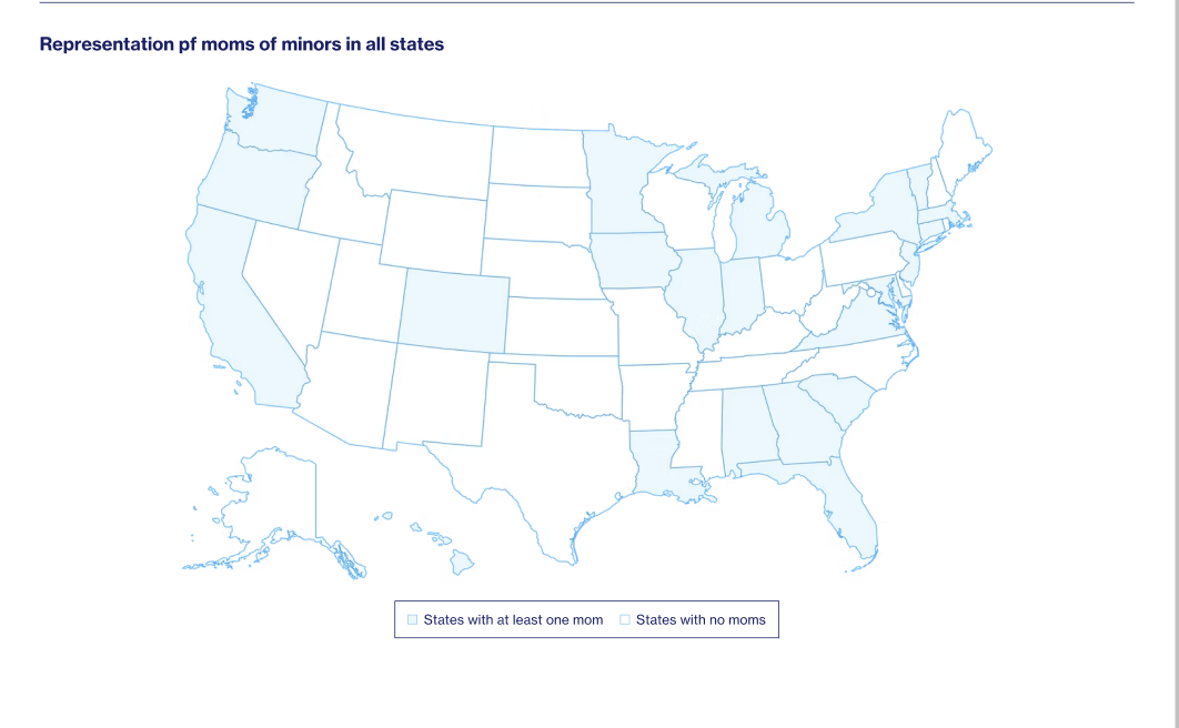
An image accompanied by a caption/legend that you supply as custom HTML (useful for chart keys, footnotes or formatted captions).

Image with Legend block
FieldTypeHow to fill it
ImagerequiredImageThe picture/diagram.
TextRich textOptional paragraph shown under the title and above the image, in the standard body font.
Custom codeText areaThe caption/legend as HTML. If you're not comfortable with HTML, ask a developer for the snippet.

Stats acf/stats NEW

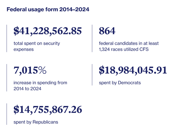
A heading plus a set of statistic items, each with its own icon/image, a figure and a short label.

Stats block
Stats block
FieldTypeHow to fill it
TitleRich textHeading above the stats.
StatsRepeaterOne row per stat: an Image (icon), a Title (the figure) and a Text (label).
Note: this is different from Multi‑Column Stats (which has no icons). Use Stats when you want an icon per figure.

Call to Action acf/call-to-action CHANGED

The base Call to Action, with an optional image and a width choice.

FieldTypeHow to fill it
TitlerequiredRich textHeading.
TextrequiredRich textBody copy.
ButtonrequiredLinkThe action button.
ImageImageOptional image beside the text.
Width new hereSelectFull (edge‑to‑edge) or Container (narrower, aligned to the page width).

Posts Filters — link to a pre‑filtered list CHANGED

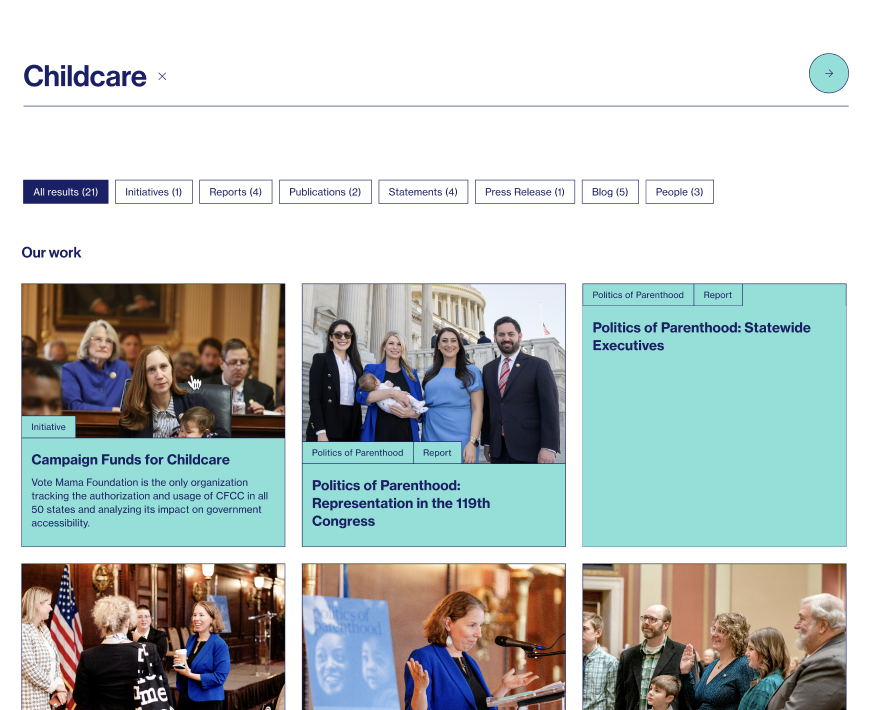
The Posts Filters block works as in the base, but on Foundation you can also open it with a filter already applied by adding a parameter to the page URL.

Link looks like…What happens
/research/?research-type=reportsOpens the page with the Type = Reports filter already ticked and the results filtered.
/research/?type=reportsShort alias — type matches the research‑type filter (the part after the dash).
/work/?work-type=a,bMultiple values — separate them with commas.
The value can be the category's slug (e.g. reports), its name, or its ID. Use this to link from a homepage tile or a menu straight to a filtered listing. The reader can still change the filters afterwards.
More content options. On Foundation, the card and filter blocks can also show Work and Research: Cards Highlight adds Work and Research to its "Cards type", and Posts Filters / News filter can target Research and Work as well as News and Actions.

Work & Research

Two new content libraries. Manage them from their own menus in the admin sidebar. Jump to one:

Content type Work work NEW

The Foundation work library. On this site it is meant to hold resources — toolkits, model legislation, templates, etc. Each item has its own page and can be listed via the card and filter blocks.

FieldTypeWhat it controls
TitleBuilt‑inProject title.
ContentEditorThe project page body.
ExcerptBuilt‑inSummary on cards.
Featured imageBuilt‑inHero / card image.
OrderPage attributesControls the sequence in listings.
Hide dateToggleHide the published date on the item.
External UrlURLIf set, the item links out to this address instead of its own page.
Back to Our Work link NEWLinkOptional. Overrides the "Back to Our Work" button on this item — set a custom link (e.g. the Politics of Parenthood page) and, if you want, a custom button label. Leave empty to use the global Page for work.

Grouping: Types (work‑type) and Themes (theme‑work).

The "Back to work" link uses Settings → Pages → Page for work by default. To send a specific item somewhere else (e.g. Politics of Parenthood State / Federal back to the PoP page), fill the Back to Our Work link field on that item.
Make "Our work" show only resources. The Our Work page lists every published Work item — the Types filter only labels and narrows them, it does not decide what shows up. So deleting the Initiative / Project terms is not enough: those items would still appear in the list, just without a type chip. To limit the page to resources, manage the items themselves — set any Project / Initiative entries to Draft or send them to Trash (or delete them).

To clean up the Types filter itself you have two equivalent options: (a) delete the Initiative / Project terms (under Work → Types), or (b) just untick those types on each Work post (in the post's right‑hand Types panel). Either way, once no published Work uses a term, that option disappears from the Types dropdown automatically (empty terms are hidden). Remember this only changes the filter / chips — it does not remove the item from the list; that's controlled by Draft / Trash above.

For the resources you keep, you can rename / replace the Type terms with resource categories (e.g. Toolkit, Model legislation, Template) and tag each item — or drop the Types filter entirely if every item is simply a resource.

Content type Research research NEW

Publications / reports — usually with a downloadable file and an author.

FieldTypeWhat it controls
TitleBuilt‑inPublication title.
ExcerptBuilt‑inSummary on cards.
Featured imageBuilt‑inCover / card image.
OrderPage attributesSequence in listings.
FileFileThe report/PDF to download.
File urlURLAlternative download link if the file is hosted elsewhere.
AuthorTextWho wrote it.
LinkLinkOptional external link (e.g. a journal page).

Grouping: Tag (research‑tag) and Type (research‑type).

Settings differences

The General options screen matches the base, with these Foundation differences. For the other tabs see VM General → Site settings.

Theme Color tab NEW

FieldTypeWhat it controls
Theme ColorSelectBlue, Pink or Green — switches the site accent colour. (Foundation adds the Green option.) Default: Blue.

Footer — newsletter

FieldTypeWhat it controls
Newsletter titleRich textHeading above the sign‑up.
Newsletter textTextSupporting copy.
Newsletter code new hereRich text / HTMLPaste a newsletter provider's embed code here to use their form instead of the built‑in one.

Pages tab — new entry

FieldTypeWhat it controls
Page for work NEWPageTarget of the "Back to work" link on a single Work item.
Page for jobsPageTarget of "Back to jobs" (same as VM PAC).
Note: on Foundation the footer "Follow links" are plain links (no per‑link icon image, unlike the base/PAC).